In Factor, any board can be pivoted using six different layouts, each of which serves a crucial purpose. The available layouts are:

  • Kanban. This view is the gold standard for workflows. It’s great for moving cards in a stack from left to right across columns as part of a process - e.g., content production, problem solving, or experimentation.
  • Gantt. This view is similar to a calendar. It’s great for managing dates and dependencies and getting a sense for timelines.
  • Table. This view is similar to a spreadsheet. Each row represents a card, and the cards are grouped together as rows nested under their stacks. Each column is a data field associated with at least one stack or card on the board. This view is great for managing many cards at once, especially if you want to filter and sort to get a structured understanding of what you’re working on.
  • Gallery. This view is like sticky notes on a whiteboard. Each stack appears as a row with all of its cards in an organized pile next to it. This view is great for collecting and reviewing ideas, tools, and resources.
  • Roadmap. This view is like a schedule planner. Each row is a stack, and each column is a unit of time - a day, week, month, quarter, or year. This view is great for planning and project management, where each card is a deliverable to be executed within a specific timeframe.
  • Stacks only. In this view, the stacks appear all together in a gallery format. This view is great for zooming out and looking at all the priorities related to the workspace. It’s especially useful as an “inbox”, where you can quickly add cards or posts to stacks without thinking about where to organize them with columns or data fields.

To choose a layout:

  1. Click on the Board app in the workspace for which you’d like to set up the layout
  2. In the upper right of your screen click “Layout”.
  3. Hover your cursor over “Layout” to see the layout options.
  4. Click on the layout you would like to use.
The "Layout" menu pulled open at the top right of "@ Ohio North rollout's board", listing all six pivots in one column: "Kanban" with a tick beside it, then "Gantt", "Table", "Gallery", "Roadmap" and "Stacks only". The panel it opens from shows the two settings the menu actually controls — "Layout   Kanban" and "Group by   Work stage" — so choosing a layout and choosing what the columns mean are separate steps. Behind the menu sits the board itself, with "Views", "Show", "Filter 0" and "NEW STACK" along the same top bar.

How do I use the Kanban layout?

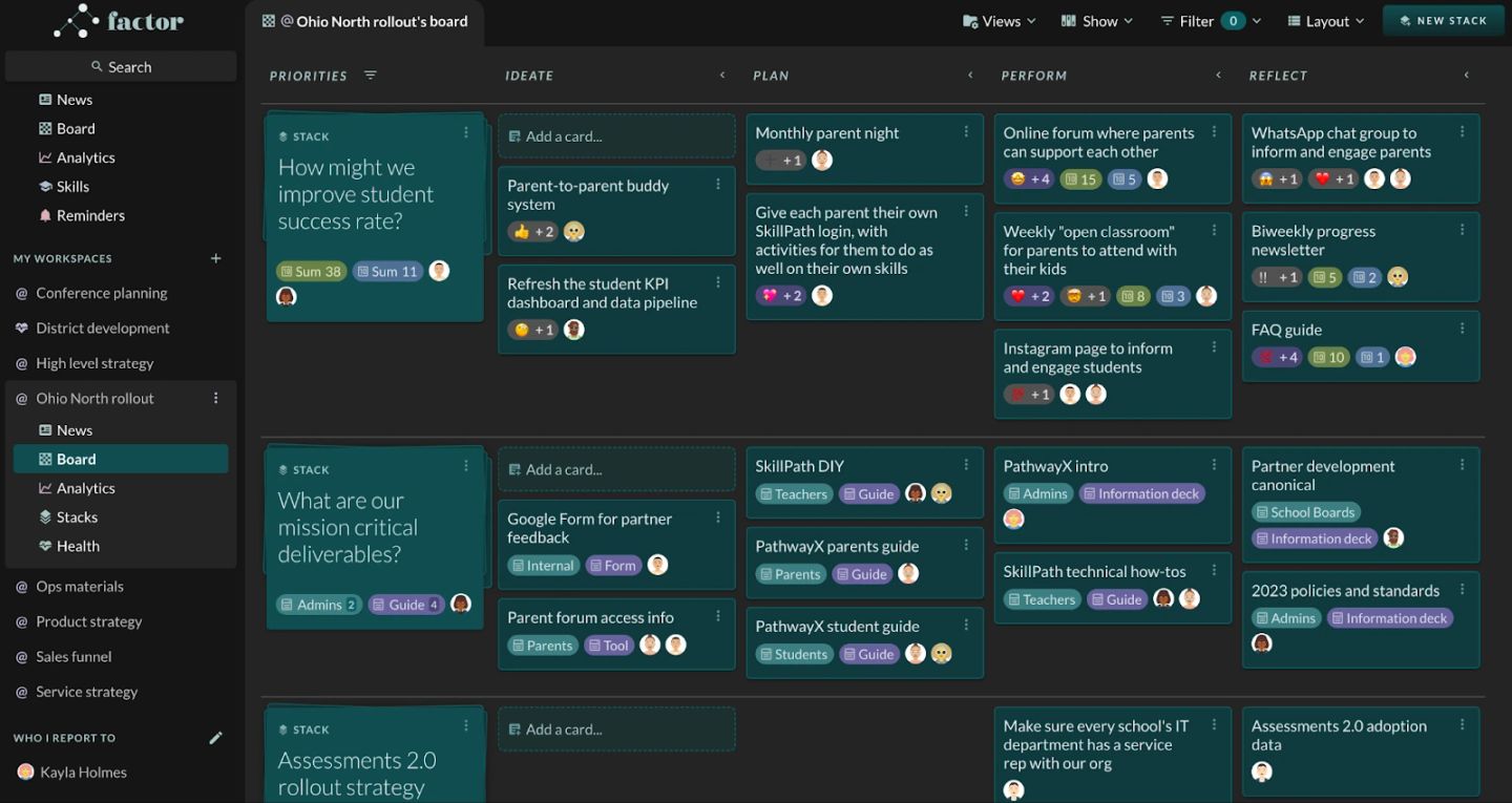
The kanban layout allows you to move ideas across during work stages. The default setting includes: ‘ideate’, ‘plan’, ‘perform’, and ‘reflect’. Ideate represents initial ideas. Plan represents ideas you are considering moving forward. Perform represents ideas you are working. Reflect represents ideas that you’ve completed and have captured what you’ve learned.

The Kanban layout in full: a "PRIORITIES" column of stack cards on the left, then the four work-stage columns "IDEATE", "PLAN", "PERFORM" and "REFLECT" running left to right, each holding cards for one stack. The stack "How might we improve student success rate?" owns the top row, with cards such as "Parent-to-parent buddy system" in IDEATE, "Monthly parent night" in PLAN, "Online forum where parents can support each other" in PERFORM and "FAQ guide" in REFLECT; the row beneath belongs to "What are our mission critical deliverables?". Cards carry owner avatars, emoji-reaction counts and field chips such as "Sum 38", "Teachers" and "Guide", and every stack row starts with a dashed "Add a card…" tile.

How do I use the Gantt layout?

The Gantt layout allows you to see ideas/tasks in a timeline view. You can click on the bar graph to directly adjust dates on a given card.

The Gantt layout: a frozen "Title" column on the left lists each stack with its cards indented beneath it, and the right side is a timeline headed "2023" with month columns from Feb to Sep. Each card gets one teal bar positioned by its dates — "WhatsApp chat group to inform and…" a short bar in February, "Online forum where parents can suppo…" a long one from April onward — while the stack's own bar spans the whole range its cards cover. A purple "Now" marker runs down the grid at late March, which is what makes the view readable as schedule rather than list.

You can use the Layout menu near the top right of the page to format and group the information on the page.

The "Layout" menu open while the board is in Gantt, showing what that layout adds: "Layout   Gantt" and "Timescale   By month", with "Expand all", "Collapse all" and "Export" below. The timescale submenu is flipped out beside it — "Zoom to fit", a greyed-out "Show Today", then "By day", "By week", "By month" (ticked) and "Year" — so the same bars can be re-scaled without touching the dates. The Gantt grid and its purple "Now" line are visible behind.

How do I use the Table layout?

The table view allows you to see your cards in a structured table format. You can click into the card or field to update it directly.

The Table layout, one row per card grouped under its stack, with the columns "Title", "Start date", "End date", "Owners", "Work stage" and "Emoji tag". Dates sit in tick-box cells that can be edited in place ("2/02/23", "2/28/23", "10/31/22"), owners appear as named avatar chips, and work stage is a numbered chip — "① Ideate", "② Plan", "③ Perform", "④ Reflect" — so a whole board's status can be scanned in one screen. Red and amber bell icons flag dates needing attention, and each stack group ends with an "Add a card…" row.

How do I use the Gallery layout?

The gallery view allows you to see a broad view of all the cards for a given stack.

The Gallery layout: each stack sits as a title card on the left — "What are our mission critical deliverables?", "How might we improve student success rate?" — with all of its cards spread out beside it in a loose pile rather than in stage columns. Every card face carries an "Add a new post" composer, which is the point of the view: it is for reading and adding to material, not for moving it along a process. The "PathwayX intro" card shows a pinned post from Kayla mentioning "@Ops materials" with an image attached, so pinned content is visible without opening the card.

How do I use the Roadmap layout?

The roadmap view allows you to see ideas/tasks by a user defined time sequence by stack.

The Roadmap layout, where the columns are stretches of time rather than work stages: "LAST WEEK 3/19/23 to 3/25/23", "THIS WEEK 3/26/23 to 4/01/23", "NEXT WEEK 4/02/23 to 4/08/23", "WEEK OF APR/9 4/09/23 to 4/15/23" and a "FUTURE" column beginning 4/16/23. Each row is a stack and each card sits in the week it is due, so the board reads as a delivery schedule; every cell also offers "Add a card…", meaning work can be created straight into a week.

To adjust the roadmap view, click the Layout button in the top right, hover on the category you would like to update (e.g, zoom level, columns before and after, etc.), and select an option.

A close-up of the "Layout" menu with the board in Roadmap, showing the four dials that shape the time axis: "Layout   Roadmap", "Group by   Start date", "Zoom level   Weeks", "Columns before   1" and "Columns after   2". The zoom submenu is open alongside — "Days", "Weeks" (ticked), "Months", "Quarters", "Years" — and behind it the column header still reads "NEXT WEEK 4/02/23 to 4/08/23", the range those settings produced.

How do I use the Stacks Only layout?

The stacks only view allows you to see a view of all the stacks associated with the workspace you are working in.

The Stacks only layout: no columns at all, just the workspace's three stacks side by side as large cards — "What are our mission critical deliverables?", "How might we improve student success rate?" and "Assessments 2.0 rollout strategy" — each with its owners and an "Add a new post" box. Stripped of stages and fields, the view is a list of the workspace's priorities and an inbox for dropping posts against them.